 Home
Home Buy SIM
16
Aug
 6067.0 views
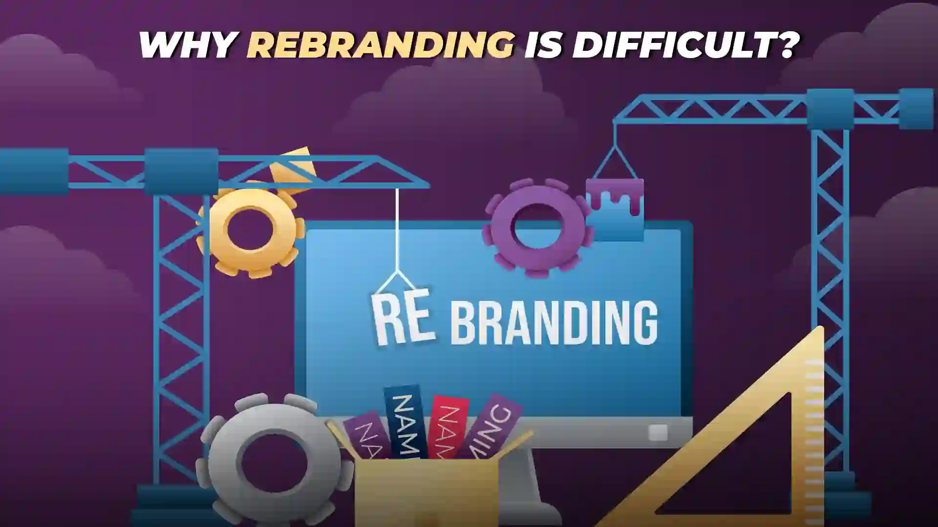
Why can Rebranding be a tough challenge?
The last few years have seen a slew of rebranding exercises, Facebook changing to Meta, Dunkin Donuts becoming Dunkin', Volkswagen, Kia Uber, Air B&B, Juventus, Valentia Football Clubs, and now closer home Air India & earlier Vodafone Merging to become VI.
There are different reasons for each brand to consider rebranding, but one thing which reflects the VUCA World we live in is the rate at which the brands are being forced to rebrand.
Reasons for Rebranding: Adapting Changes

The rate of technological change is making brands rebrand or else face extinction. When Meta came into existence, the Metaverse was hot, and Facebook wanted to take advantage of it by making a first mover advantage. As such, Facebook's product portfolio needed an umbrella brand to house all its different offerings. It needed to consolidate its portfolio, enter a new technological market, and keep its corporate identity separate from that of a particular product. Therefore, preserving the distinct identity of one's product without transferring it to others and appealing to a younger audience by exuding a youthful vibe.
Volkswagen Rebranding Strategy
With the launch of its new electric car, the i3, Volkswagen needed an identity reflective of its latest offerings. This innovative vehicle marked a significant step forward for the company regarding technology and redefining its brand identity.
As part of this transformation, the company introduced a new logo and visual identity that embraced a more modern and futuristic aesthetic. The logo retained the classic VW emblem while incorporating subtle elements representing electricity and motion, symbolizing their evolution into the electric era.
KIA Rebranding Strategy
Kia had an image of the poor design language in their vehicles and hence relied on its rebranding exercise to convey the new design philosophy of its car and, therefore, the new logo. That was one of many reasons for Kia to change its branding. It also needed to convey its electric car portfolio, dropping Motors from its name and becoming Kia.
Kia's Rebranding included a new logo that represented their forward-thinking approach. The sleek and symmetrical design embodied progress and their dedication to innovation. This logo showcased Kia's aim to revolutionize mobility in an eco-friendly way through electrification and sustainability. Kia's Rebranding wasn't just about looks – it was a strategic shift to change how people saw them and reflect their transformation. This change showed Kia's move away from the past, embracing electric goals and becoming a leader in creative design and eco-friendly mobility.
Air India Rebranding Strategy
Air India embarked on a transformative journey under the Tata Group's leadership, seeking to distance itself as a government-controlled airline. This shift addressed punctuality, service quality, and aircraft reliability challenges. The airline aimed to make a resounding statement, signalling a new trajectory.

Air India aimed to convey a compelling narrative and engage a global audience in a visual dialogue by incorporating visual imagery. This strategic change was prompted by the necessity to establish a distinctive presence in a competitive aviation market while evolving cultural dynamics, reclaiming its significance and resonance.
The Tata Group believed the existing brand design should reflect the carrier's desired identity.
Moreover, the Air India branding change has brought significant media coverage, potentially diverting attention from other bigger topics.
Negative Public Sentiment Towards Rebranding
While, of course, some of the social media commentators have been welcoming of the change. Generally, most of the chatter has been questioning the new design, if not outrightly being critical of the same.
It brings us to the central point of this article as to why rebranding exercises are generally not well received or, instead, the public is critical of this change.
The question is, why are people less accepting of the change? Is it because the people are connected to the brand? So, the changes might turn them away, or there might be a group of trolls who like to cause trouble. But usually, people prefer things to stay comfortable and familiar. Any change messes up the usual expectations, and that's why there's often a lot of noise about it.
Just imagine a group of friends with different styles and relationships with and among the group. Every friend is known for a particular style, the way of talking, how they dress, and what things they own. They are known for a specific position. This position is achieved partly through what things they do, what they own and their choices of clothes they wear. Now imagine one day they decided to change everything they stood for and change their clothes, hairstyle, selection of shoes and maybe how they talk their accent.
So how are the friends going to react to this change? Some among that Group will be appreciative, maybe their die-hard fans or people accepting of the change. The rest will generally question the difference, "Are bhai tu pagal hai, yeh kya kar diya, tu pehle hi achha lagta tha". It could be possible sneers he could face. Of course, in the case of an individual, he may or may not revert depending on his personality, but once brands decide to change or rebrand, it sticks unless things go terribly wrong. They have to retreat, and we will talk about those cases, but generally, they weather the storm.
What makes Rebranding so challenging?
From the brand's perspective, Rebranding is challenging because the brand followers feel they are losing their autonomy and resist it. These followers strongly connect their identity to the brand, so to stay connected, they'd need to change too – which is hard for everyone. It's like when a friend changes; others might resist because they'll need to try to adapt, leading to objections.
The Brand design language is the brand's visual voice; any change in that changes the brand's visual appeal.
Since this is a predictable response, the brands generally have to prepare the audience and their internal teams for the change and should prepare answers to this change. If post-rebranding questions are handled well, the difference will go smoothly, and that's a success. This is where PR agencies come in – they play a vital role in helping a brand make this change.
So, with Air India, as discussed above, there are questions about why they're removing the Maharaja’s character. This decision is tied to emotions, but Air India needs to move away from the past. They can handle it by explaining that the phase-out is for international audiences, not the Indian market, where the Maharaja is familiar. There might also be questions about the Chakra a symbol on the tail. It's emotional and looks Indian, but it might need to go for an international image. The Chakra works well on a sports team's t-shirt but not so much for an airline that wants to appeal to passengers from different countries. Think of it as a reminder of a country that lost to us in cricket, football, or javelin – not the best message for
fans of other countries.
Emotional Connection: Brands and Audience
There is an emotional connection with the brands of the audience, especially brands like Air India, which has a long history and reputation. In such cases, a rebranding is not just a change in font, logo or design; it is a whole host of memories and nostalgia associated with the brand. In such a case, there is a disruption in the emotional connection the people have towards their brand, and they can't take it lying down.
A rebranding exercise is not just a change in the brand; it is a change in the relation between the brand and the audience; if not a complete reset of the relationship, it could at least creep, some doubts in the mind of its user, questioning how the service will work going forward. It could break a relationship or damage the reputation if handled poorly.
As such, humans are drawn towards familiarity, with a general fear of the unknown. A rebranding is in the realm of uncertainty, and hence people generally need more acceptance.
Also, the acceptance of Rebranding is different for different industries. For example, in the Fashion industry, people know these brands bring in new designs and products; generally, a rebranding could be more accepting.
INSTAGRAM: The Instagram brand changed from a camera to a vector design that put whole generation into confusion. Once it changed its orientation from still to reels after it faced on-slaught from Tik-Tok that resulted in a complete backlash against the brand, led by their famous creator Kim Kardashians.She raised concerns that Instagram should maintain its primary focus on images rather than shifting excessively towards videos.
The brand had to effectively manage and explain this change to its users.
Failed Rebranding Case-Study
1. GAP: In the late 2000s, clothing company GAP tried to change its brand, but it didn't work out. They went back to their old brand. This happened because when GAP tried to change, they only focused on the logo and look, without adding any new features to their product line. Rebranding didn't connect with the people’s expectations, so it didn't work. Changing only how things look without changing what they offer or how they help people doesn't really work well.

As mentioned earlier in the article the sales of GAP were decreasing, and so was the share price, which tanked over 40% during the "Great Recession. To refresh the brand and attract new customers, GAP decided to rebrand in Oct 2010 and spent over $ 100 Mn. As such Gap was known for less trendy clothes, but they were extremely comfy, excellent quality and at low prices, something they have been doing for over 20 years.
The Rebranding was poorly received, and its consumers trolled the brand with negative reviews on their Twitter accounts. Moreover, they launched a "Make Your Own Gap Logo" website which went viral and generated over 14k parody versions of the Gap Brand.
- GAP needed to prepare their customers for the upcoming change, and they could have explained why it had to change and what they were trying to achieve with the new branding.
- When the branding was released, they used the typeface Helvetica, an obsolete font. Infact some companies were already using the font, including some of its competitors.
· In response to the backlash, GAP returned to the old logo in six days.
2. Tropicana: A Pepsi brand, also tried to rebrand in the same period around 2009 and wanted to go with the existing trends.

Tropicana made a change by replacing the orange straw with a clear glass of juice. The Logo orientation was also vertical; The whole idea was to emphasize the brand message “100% orange, Pure & Natural”.
A few days into the launch, consumers started criticizing the change, even calling it "ugly" & "Silly" and comparing Tropicana's premium juice to cheap local versions. Moreover, Tropicana saw huge dip in sales of a whopping 20% and suffered a loss of nearly $30 Mn.
Many things went wrong with the Rebranding, but the most of it was that brand needed to be recognized, in fact there was no connection with the earlier branding and that did not help the case.
As a result, in Feb 2009, Tropicana announced its return to its original packaging design.
3. Mastercard: Its logo was already iconic, with two circles, yellow and red, intersecting. But the brand wanted to change to emphasize its global reach.
Mastercard made changes by adding a new see-through logo to its circles and moving the words "Mastercard" below the logo. They said the three circles stood for different parts of their work. They also got a new slogan - "The Heart of Business." But people didn't like the new logo, and after spending a lot of money on it, they changed it back quickly.
What seemingly went wrong was the introduction of the 3rd circle, which became complicated, with too many elements. It would have been wiser to consider the pre-launch research findings before making a decision, especially since the board had the final say in the matter.
Conclusion
Rebranding can be challenging because people have feelings for brands and like what they know. But if done right, rebranding can change the fortune of the brands. To do it well, brands need to plan a lot and talk clearly. They should expect people to not like it, get their teams ready, and tell everyone why they're changing.
Balancing innovation and familiarity is critical to a successful rebranding strategy that must honour core values while adapting to a changing world.
Follow us


